Live Helper Chat support forum.. Forum is locked. New place for questions - Github Discussions
You are not logged in.
- Topics: Active | Unanswered
Announcement
Pages: 1
#1 2017-12-02 22:08:52
- arjoni
- Member
- Registered: 2015-12-10
- Posts: 86
Design error
Hello,
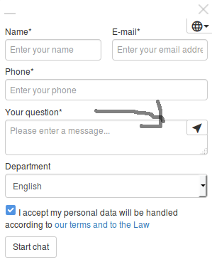
What is this button? It appears when chat is online. It looks like clicking on it is the same as clicking on start chat.

Offline
#2 2017-12-02 22:10:09
- PeopleInside
- Administrator

- From: Italy
- Registered: 2014-04-10
- Posts: 4,046
- Website
Re: Design error
Hi arjoni,
as you tried to point the mouse over?
Is a send button.
Here can start a chat if you press.
 PeopleInside - Live helper chat - free limited forum support!
 For commercial support or GitHub [see FAQ here]
 If you want to support this open source project, just donate [see support page]
 Something wrong with the forum? [contact a superhero]
Offline
#3 2017-12-02 22:12:41
- arjoni
- Member
- Registered: 2015-12-10
- Posts: 86
Re: Design error
Yes, I noticed that. But why was this added when chat can be started by clicking start chat. There are 2 buttons that do the same thing. Isn't this a design problem?
Offline
#4 2017-12-02 22:14:50
- PeopleInside
- Administrator

- From: Italy
- Registered: 2014-04-10
- Posts: 4,046
- Website
Re: Design error
I do not know, this was a decision by the chat owner.
 PeopleInside - Live helper chat - free limited forum support!
 For commercial support or GitHub [see FAQ here]
 If you want to support this open source project, just donate [see support page]
 Something wrong with the forum? [contact a superhero]
Offline
#5 2017-12-02 22:16:16
- arjoni
- Member
- Registered: 2015-12-10
- Posts: 86
Re: Design error
It can also confuse visitors.
Offline
#6 2017-12-02 22:23:45
- PeopleInside
- Administrator

- From: Italy
- Registered: 2014-04-10
- Posts: 4,046
- Website
Re: Design error
arjoni, the forum is not the place where discuss about code, supposed bugs etc.
You are not new, you should know.
Also if you need you can hide the elements you do not want by customizing the design or use CSS.
The button has been added because many users have requested it after was removed in the past also for requested from users.
You can see the documentation for learn about how override templates.
 PeopleInside - Live helper chat - free limited forum support!
 For commercial support or GitHub [see FAQ here]
 If you want to support this open source project, just donate [see support page]
 Something wrong with the forum? [contact a superhero]
Offline
#7 2017-12-02 23:07:00
- arjoni
- Member
- Registered: 2015-12-10
- Posts: 86
Re: Design error
If anyone wants to remove it, add
.btn-group-xs > .btn, .btn-xs { visibility:hidden; }at custom css at widget theme.
Last edited by arjoni (2017-12-02 23:07:34)
Offline
#8 2017-12-04 15:59:21
- remdex
- Administrator

- From: Lithuania
- Registered: 2012-09-23
- Posts: 3,661
- Website
Re: Design error
This button makes sense. Then start chat requires only text area, because in that case start chat button is hidden. I ques it can be improved to hide it if there is more than text field 
Offline
#9 2017-12-04 18:29:17
- arjoni
- Member
- Registered: 2015-12-10
- Posts: 86
Re: Design error
Yes, that makes sense.
Offline
Pages: 1